Tips
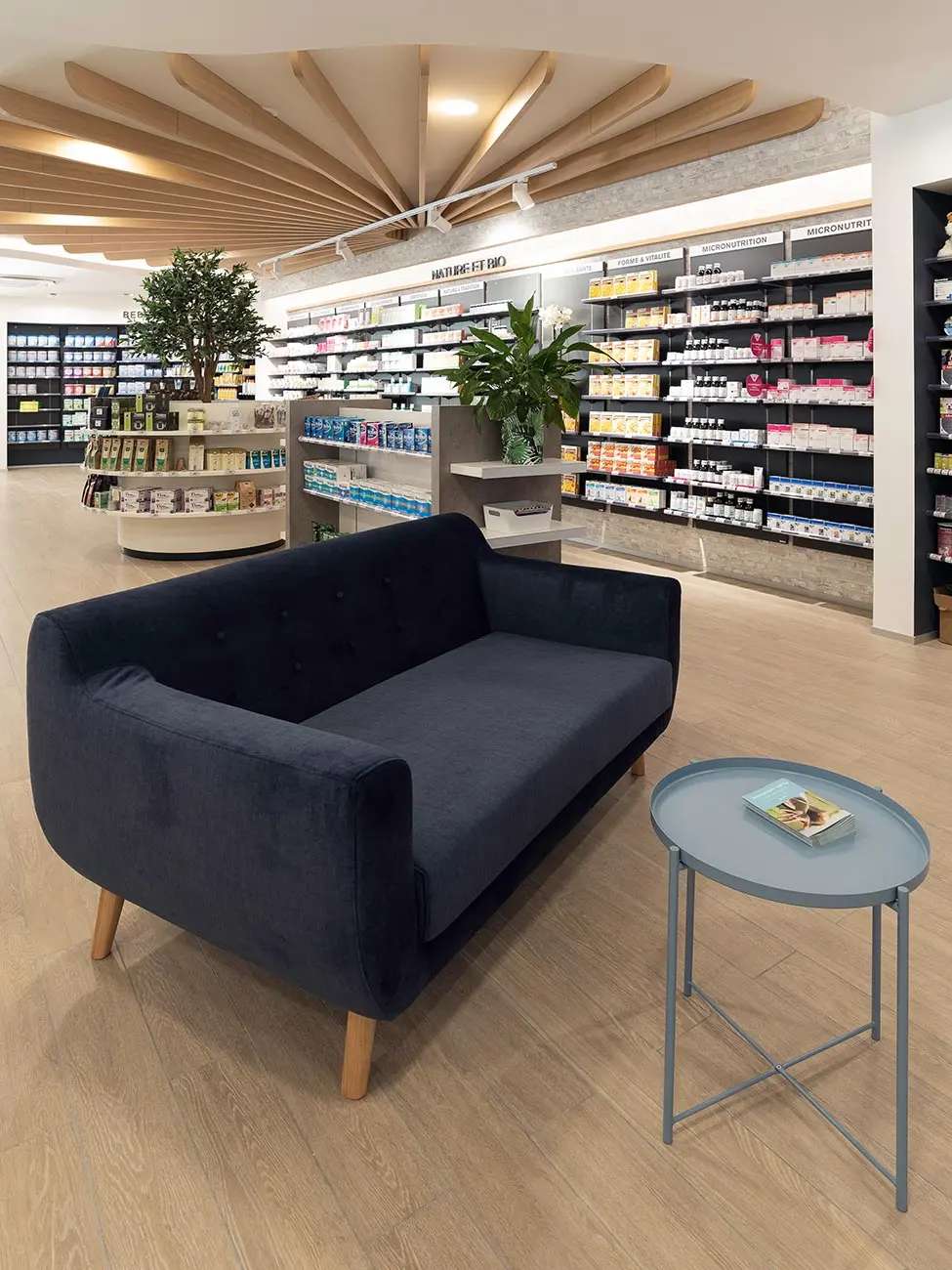
Ceramic tiles in pharmacy architecture: material, strategy and performance
tips

Share this post
In any remodeling project, homeowners carefully think about every detail and one of the most important is the color scheme. In addition to creating the right environment, colors can visually correct the size of the space and change the individuality of any room. Typically, warm colors convey positive emotions and contribute to a feeling of serenity, while colder tones provoke a feeling of calm and relaxation. The correct choice of colors guarantees the integrity of the decoration and the brand identity. Discover, in this article, how to combine complementary colors in interior design!
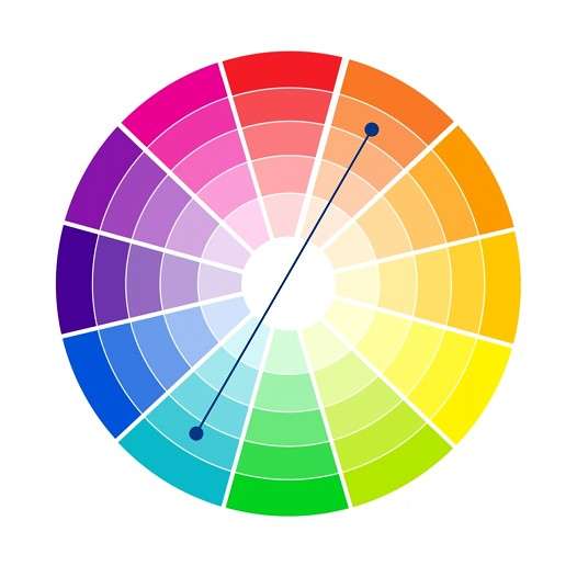
The color wheel is made up of 12 colors. There are 3 primary colors: red, yellow and blue. Secondary colors: orange, green and purple and the remaining 6 colors, called tertiary or intermediate, are obtained by mixing primary and secondary colors.
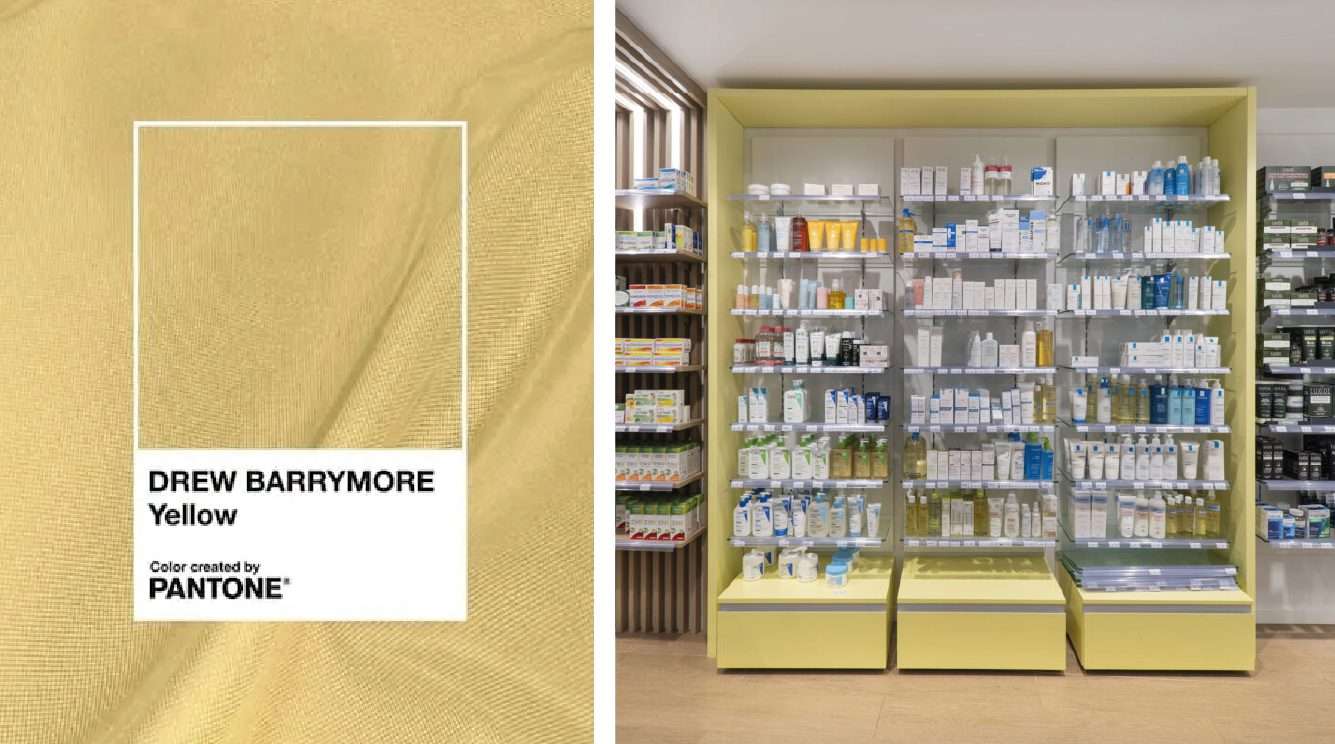
A complementary color scheme is made up of colors that are positioned at opposite ends of the color wheel and therefore complement and amplify each other. On the color wheel, you can find 6 different combinations. For example, blue and orange, red and green, purple and yellow, among others. These colors create a high contrast, which is why they are used when you want to highlight something.
In interior design, there are no ugly colors, only inappropriate colors. When correctly applied in the interior, the combination of complementary colors positively affects people's mood and well-being. Here are some tips to create a distinct and harmonious interior with this color combination:
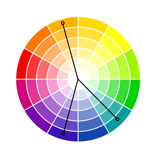
Complementary color schemes, in their most basic form, are made up of two colors, but can be expanded to tones with different saturation and intensity. The so-called “classic triad”, for example, is a combination of three colors that are equally spaced on the color wheel. For example: red, yellow and blue. The result is a three-tone scheme that still has a strong visual contrast, but not as strong as the basic two-tone scheme. However, if colors are used in equal amounts, the scheme may appear unbalanced, so it is recommended to choose a dominant color.
Often, interiors decorated in this color scheme have a more formal or ethnic look. In styles such as Boho Chic or Moroccan, where the expressiveness of colors is a distinctive feature, this color scheme is often used.
However, to create a more subtle contrast, it is recommended to reduce color saturation and opt for soft, warm tones. This makes the contrast softer, but maintains the balance of the composition.
With complementary colors, such as yellow and purple, blue and orange or red and green, each color tone has its own intensity, so you should be careful in your experiments. Use wall accessories (like a painting or clock in a complementary color scheme) to provide a strong but pleasing contrast.
Our team of architects, designers and engineers designs elegant environments and solutions, with the aim of improving the quality of life for patients, families and healthcare professionals. Count on us!
Contact us!
Count on a multidisciplinary team with extensive experience in developing construction and renovation projects. Count on Medd’s professionals to ensure the success of your project. Contact us today!
Find inspiration for your renovation projects. Follow us and stay up to date with the latest news.