Tips
Ceramic tiles in pharmacy architecture: material, strategy and performance
tips

Share this post
Light and color are two of the most important aspects of decoration. And why? Well, think of a pharmacy. Is it already? Now think about your favorite restaurant. What do they both have in common? That's right! A nice lighting scheme and an attractive color palette!
If you think about it, when it comes to the design of any commercial environment, these elements are fundamental for creating the first impact, having a lasting effect on the customer's memory. Although there are no strict rules regarding your planning, Medd professionals have some tips to share with you. Discover everything in this article!
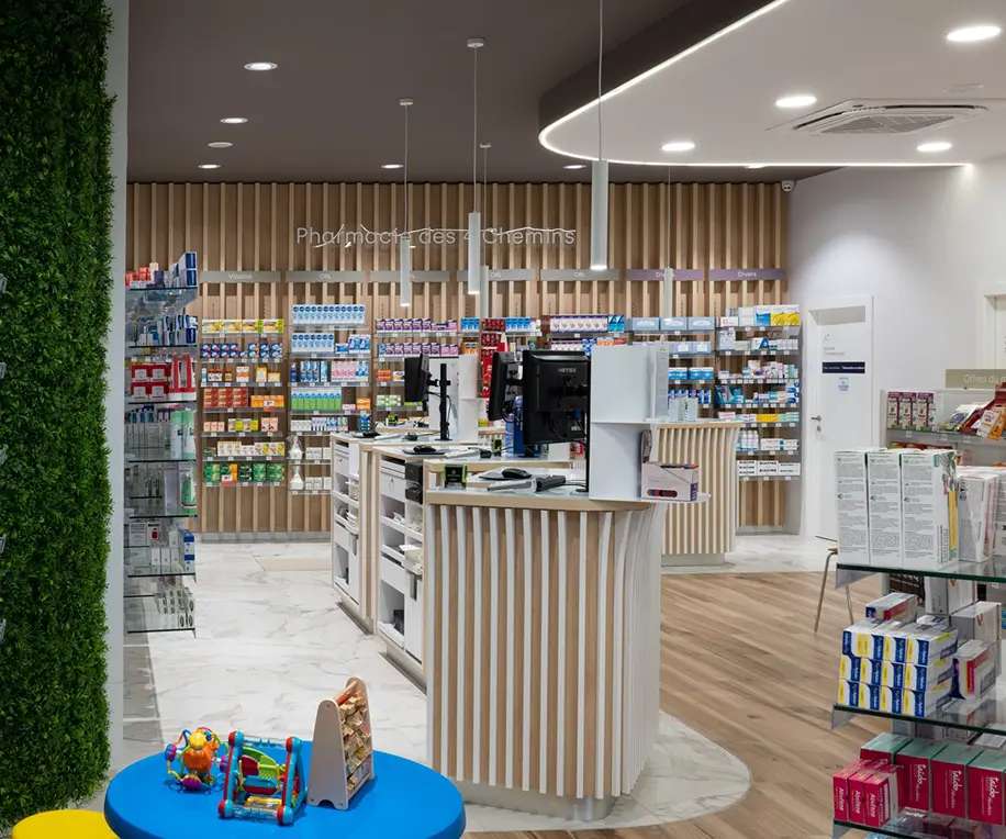
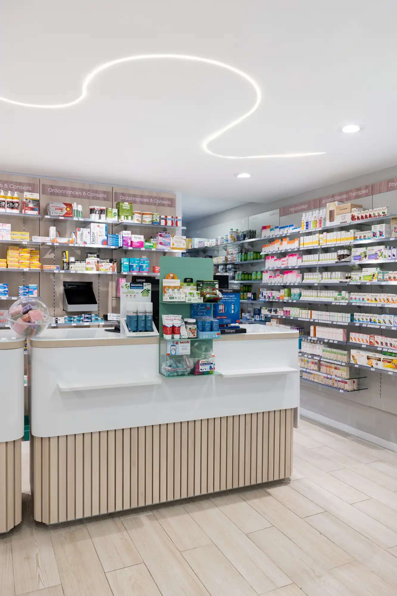
To create visual interest, it is essential to illuminate every corner of your pharmacy, creating multiple levels of lighting.
Firstly, define the general lighting of the space, by installing lamps, spotlights or reflectors. Then, determine thesecond level of lightingwith the help of wall sconces or floor lamps. This type of lighting is designed to illuminate a specific area of the pharmacy, highlighting a particular category of products.
Finally, the third level has a more specific purpose: lighting a functional area, such as the service area. This type of lighting serves the purpose of assisting the pharmacist in carrying out tasks, with the help of smaller spotlights, but with greater light intensity.
Additionally, when a designer on our team designs a space, they give it an extra dimension and consider a fourth level of lighting, using the installation of recessed lighting. This not only gives the decoration a sensorial base, but also helps to create a comfortable atmosphere for users and the team of pharmacists.
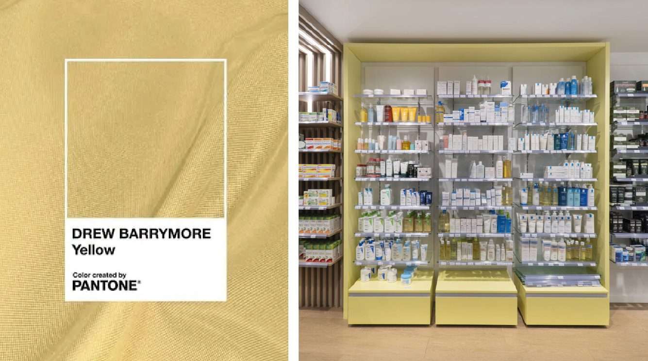
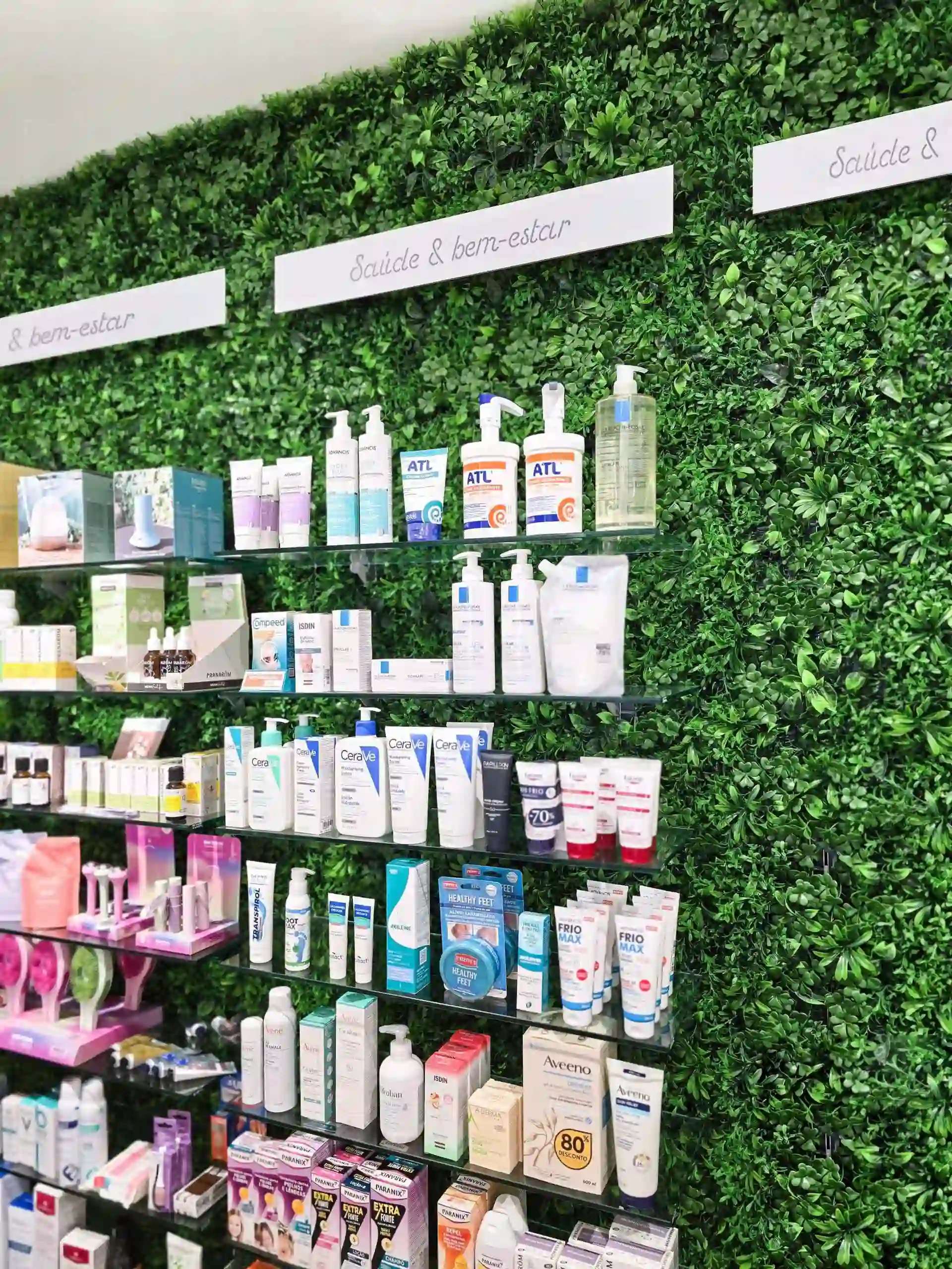
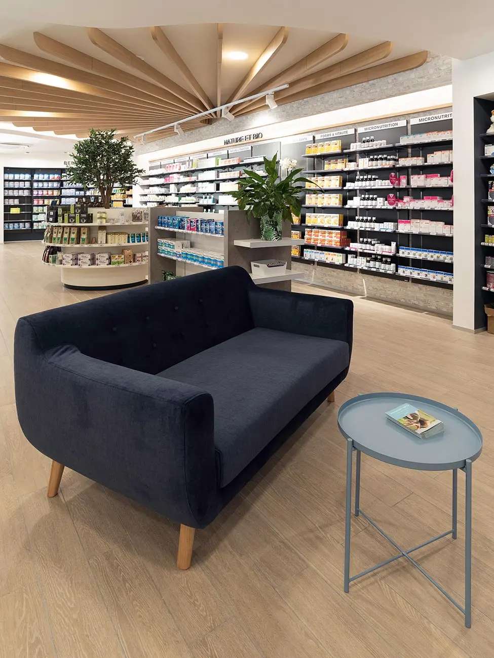
After defining the ideal lighting scheme for your pharmacy, it's time to think aboutcolorsthat make up the space. At this point, it is important to remember that lighting can emphasize or soften the chromatic load of the selected colors. That is, the perception of colors differs depending on the light present in the space. Depending on the light, the color tone changes, especially when it comes to natural light orartificial light.
Therefore, lamps with blue light, for example, reduce the intensity of colors such as yellow, orange or red, while light and neutral tones are less prone to changes.
On the other hand, when it comes to natural light, it is important to consider the change in its tone during the day. After all, morning light is not the same as afternoon light or midday light.
As such, you should test the behavior of the colors before making a definitive decision. For this reason, we recommend that you use a sample of the desired tones and test their relationship with the space, before painting the walls of your pharmacy.
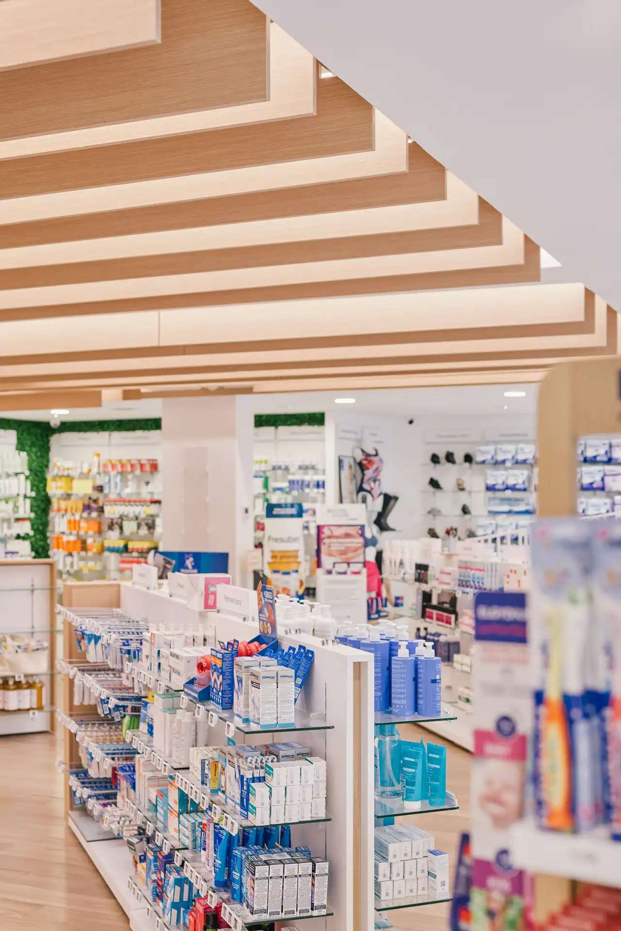
The relationship between light and color meets the need to “expand” or “narrow” the area of any interior space, as well as the need to “raise” or “lower” the ceiling. That is, when there is no way to increase the size of the space or increase its ceiling height, architects and interior designers often resort to the relationship between light and color to do so. But how?
Well, first of all, you need to understand that light surfaces tend to reflect light. As such, by directing streams of light onto vertical surfaces of light tones, it is possible to visually expand the size of the room.
On the other hand, if the objective is to make a large space more welcoming, then you should use dark colors, as they have low reflectivity. Likewise, when the objective is to reduce the depth of a long room, the back wall is generally painted in dark tones, keeping the sides light, to reduce the length of the space.
On the other hand, with regard to the ceiling, the same happens. In other words, in spaces with very high ceilings and plenty of natural light, a darker tone will create a feeling of coziness. Conversely, to lengthen the perception of a more compact space, it is advisable to combine dark walls with a light ceiling and floor.
To offer an additional touch to thedecorative stylefrom your pharmacy, you should find the right color combination. To achieve this, it is worth taking into account some decorating tips. For example:
Our team of architects, designers and engineers designs elegant environments and solutions, with the aim of improving the quality of life for patients, families and healthcare professionals. Count on us!
Contact us!
Count on a multidisciplinary team with extensive experience in developing construction and renovation projects. Count on Medd’s professionals to ensure the success of your project. Contact us today!
Find inspiration for your renovation projects. Follow us and stay up to date with the latest news.